Custom Admin UI Navigation
In this guide, we'll show you how to create a custom Navigation component to be rendered in the Admin UI.
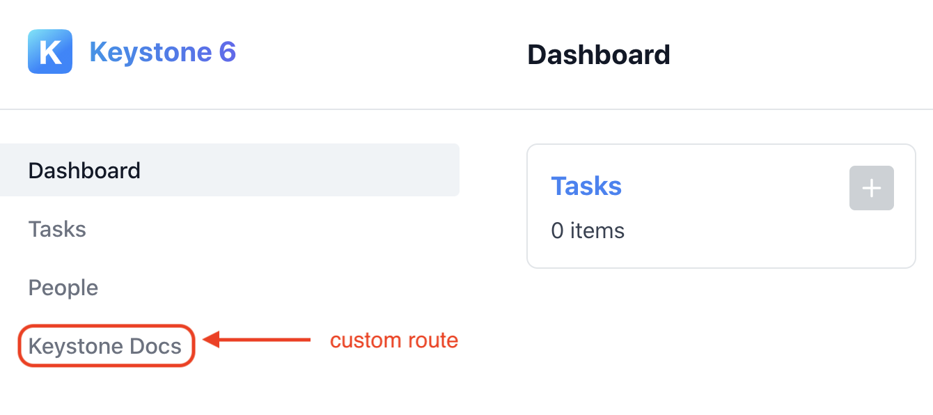
By the end of this guide you should have a custom Navigation component rendering in the Admin UI with a custom route pointing to the KeystoneJS docs. 
Adding the custom navigation component to the Admin UI
The first thing you'll need to do is to specify an /admin/config.ts file in the root of your Keystone project.
Reference your custom Navigation component in the export as so.
// /admin/config.tsimport type { AdminConfig } from '@keystone-6/core/types';import { CustomNavigation } from './components/CustomNavigation';export const components: AdminConfig['components'] = {Navigation: CustomNavigation}
Creating your custom Navigation component
The next step is to create our CustomNavigation React component. In the root of your project create a new tsx file at /admin/components/CustomNavigation.tsx.
Here we'll export our CustomNavigation component as a named export.
// admin/components/CustomNavigation.tsximport type { NavigationProps } from '@keystone-6/core/admin-ui/components';export function CustomNavigation({ authenticatedItem, lists }: NavigationProps) {return ({/* ... */})}
Keystone will pass the following props to this component.
type NavigationProps = {lists: ListMeta[];authenticatedItem: AuthenticatedItem}
For more information on the props, please see the Navigation Props section of this guide.
Setting up the layout
Next we'll want to import some components that Keystone provides to help us build our custom Navigation.
import { NavigationContainer, NavItem, ListNavItems } from '@keystone-6/core/admin-ui/components';
The NavigationContainer component provides a container around your navigation links, as well as the different states of the authenticatedItem prop. We'll need this to:
- Make our
CustomNavigationcomponent look and feel like the default Admin UI Navigation component. - Render out the hamburger menu with additional options should a user session be in progress via the
authenticatedItemprop.
import { NavigationContainer, NavItem, ListNavItems } from '@keystone-6/core/admin-ui/components';import type { NavigationProps } from '@keystone-6/core/admin-ui/components';export function CustomNavigation({ authenticatedItem, lists }: NavigationProps) {return (<NavigationContainer authenticatedItem={authenticatedItem}>{/* ... */}</NavigationContainer>)}
For more information on the NavigationContainer see the NavigationContainer section of the component docs below.
Rendering NavItems for Keystone lists
The ListNavItems component takes the provided Array of lists and renders a list of NavItems. We'll use this component to help us easily create NavItems from Keystone lists.
import { NavigationContainer, NavItem, ListNavItems } from '@keystone-6/core/admin-ui/components';import type { NavigationProps } from '@keystone-6/core/admin-ui/components';export function CustomNavigation({ authenticatedItem, lists }: NavigationProps) {return (<NavigationContainer authenticatedItem={authenticatedItem}><ListNavItems lists={lists}/>{/* ... */}</NavigationContainer>)}
For more information on the ListNavItems component, see the ListNavItems section of the component docs below.
Adding additional routes
The NavItem component is a thin styling and accessibility wrapper around the Link component from Next.js. We'll use this component to render our custom route as well as the Dashboard route.
import { NavigationContainer, NavItem, ListNavItems } from '@keystone-6/core/admin-ui/components';import type { NavigationProps } from '@keystone-6/core/admin-ui/components';export function CustomNavigation({ authenticatedItem, lists }: NavigationProps) {return (<NavigationContainer authenticatedItem={authenticatedItem}><NavItem href="/">Dashboard</NavItem><ListNavItems lists={lists}/><NavItem href="https://keystonejs.com/">Keystone Docs</NavItem></NavigationContainer>)}
For more information on the NavItem component, see the NavItem section of the component docs below.
Note When opting into a custom Navigation component you will need to specify a NavItem for the Dashboard page (the / route).
Putting it all together
With all that done, your Custom Navigation component should be good to go, and your /admin folder should look like this.
// admin/components/CustomNavigation.tsximport { NavigationContainer, NavItem, ListNavItems } from '@keystone-6/core/admin-ui/components';import type { NavigationProps } from '@keystone-6/core/admin-ui/components';export function CustomNavigation({ authenticatedItem, lists }: NavigationProps) {return (<NavigationContainer authenticatedItem={authenticatedItem}><NavItem href="/">Dashboard</NavItem><ListNavItems lists={lists}/><NavItem href="https://keystonejs.com/">Keystone Docs</NavItem></NavigationContainer>)}// admin/config.tsimport { AdminConfig } from '@keystone-6/core/types';import { CustomNavigation } from './components/CustomNavigation';export const components: AdminConfig['components'] = {Navigation: CustomNavigation};
Start up your Keystone project, and you should see Custom Navigation with a route to the KeystoneJS docs in the Admin UI. 
The rest of this guide will elaborate on some of the details around the helper components Keystone provides and the Navigation props that we glossed over in the main guide.
Navigation props
This section is to provide more granular information around the props that Keystone passes to your Custom Navigation component.
export const CustomNavigation = ({ lists, authenticatedItem }) => {}
Keystone passes the following props to your custom Navigation component:
type NavigationProps {lists: ListMeta[];authenticatedItem: AuthenticatedItem;}
lists is an array of Keystone list objects. Internally Keystone filters through your lists and ensures that only visible lists are passed through to you in the lists array prop.
type ListMeta = {/** Used for optimising the generated list of NavItems in React */key: string;/** href to the list route in the Admin UI. */path: string;/** Used as the label for each list generated NavItem */label: string;/** Other properties exists, but these are the ones that are relevant to the Navigation implementation */};type Lists = ListMeta[];
authenticatedItem is a union of potential authentication states, expanded on below:
type AuthenticatedItem =| { state: 'unauthenticated' }| { state: 'authenticated'; label: string; id: string; listKey: string }| { state: 'loading' }| { state: 'error'; error: Error | readonly [GraphQLError, ...GraphQLError[]] };
The authenticatedItem props is rendered automatically when you pass it into the NavigationContainer component.
If you render the authenticatedItem yourself, make sure you handle all of the possible states.
Components
Keystone exposes a variety of helper components to make building out your custom Admin UI Navigation component easier. These are:
NavigationContainer
This component renders containing markup around your navigation links, as well as as the different states of the authenticatedItem prop.
type NavigationContainerProps = {authenticatedItem?: AuthenticatedItem;}
For the shape of the authenticatedItem prop, please see the Navigation Props section above.
import { NavigationContainer} from '@keystone-6/core/admin-ui/components'export const CustomNavigation = ({ lists, authenticatedItem }) => {return (<NavigationContainer authenticatedItem={authenticatedItem}>{/* ... */}</NavigationContainer>)}
ListNavItems
This component takes the provided array of lists and renders a list of NavItems.
import { ListNavItems } from '@keystone-6/core/admin-ui/components'
The lists object has the following type:
type ListNavItemProps = {lists: ListMeta[]include: string[]}
If an include prop is supplied, the component will only render out lists that match the list keys specified in the include array.
const CustomNavigation = ({ lists }) => (<NavigationContainer><ListNavItems lists={lists} include={["Task"]} /></NavigationContainer>)

Otherwise, all lists will be added.
const CustomNavigation = ({ lists }) => (<NavigationContainer><ListNavItems lists={lists} /></NavigationContainer>)

NavItem
This component is a thin styling and accessibility wrapper around the Link component from Next.js
import { NavItem } from '@keystone-6/core/admin-ui/components'
It expects the following props:
type NavItemProps = {// The path or URL to navigate tohref: string,// React children of the componentchildren: ReactNode,// Toggles on the selected style and aria-current attribute of the NavItemisSelected: boolean}
By default the isSelected value will be evaluated by the condition router.pathname === href. Pass in isSelected if you have a custom condition or would like more granular control over the "selected" state of Navigation items.
Related resources
Example: Custom Admin UI Navigation →
Adds a custom navigation component to the Admin UI. Builds on the Task Manager starter project.
Custom Admin UI Logo Guide →
Learn how to add your own custom logo to Keystone’s Admin UI.
Custom Admin UI Pages Guide →
Learn how to add your own custom pages to Keystone’s Admin UI.